![]()
A Rough Guide to the Jet Stream: what it is, how it works and how it is responding to enhanced Arctic warming
Posted on 22 May 2013 by John Mason
Barely a week goes by these days in the Northern Hemisphere without the jet stream being mentioned in the news, but rarely do such news items explain in detail what it is and why it is important. As a severe weather photographer this past 10+ years, an activity which requires successful DIY forecasting, I’ve had to develop an appreciation into what makes it tick. This post, then, is a start-from-scratch primer based on that knowledge plus some valuable assistance from academia into where the current research is heading. Because of its length and breadth of coverage, I’ve broken it up into bookmarked sections for easy reference: to come back here click on ‘back to contents’ in each instance.
Contents:
Earth’s Troposphere – an introduction
Weather systems aloft – the Polar Front and the jet stream
Waves on the jet stream – upper ridges and troughs
Positive vorticity – a driver of severe weather – and the jet stream
Wind-shear – a driver of severe weather – and the jet stream
Jetstreak development along the jet stream – a driver of severe weather
Northern Hemisphere atmospheric circulation patterns: the Arctic and North Atlantic Oscillations
Climate change and the future: how will the jet steam and pressure-patterns respond?
Earth’s Troposphere – an introduction
We live at the bottom of a soup of gases, constantly moving in all directions – our atmosphere. Virtually all of our tangible weather goes on in its lowest major division, the Troposphere. This division varies in average thickness from about 9000m over the poles to 17000m over the tropics – in other words, it’s thinnest in cold areas and thickest in hot areas, because hot air is more expansive than cold air. Likewise it fluctuates in thickness on a seasonal basis according to whether it’s warmer or colder. Above it lies the Stratosphere, while below it lies the surface of the Earth.
The junction with the Stratosphere is known as the Tropopause and as the diagram below shows, it is a major temperature inversion: although it gets colder with height in the Troposphere, at the Tropopause it suddenly warms. The inversion is so strong that convective air currents, which involve parcels of warm air rising buoyantly through cooler surroundings, fail to penetrate it. That is why the flat, anvil-shaped tops of convective cumulonimbus (thunderstorm) clouds spread out laterally beneath the Tropopause, as though it were some ceiling in the atmosphere.

above: section through the lower 100km of Earth’s atmosphere. The thick black zigzagging line plots typical changes in temperature from the surface upwards; height above surface is the LH scale and typical pressure with that height is the RH scale.
The Troposphere, which this post concerns, can be divided into two subsections: an upper layer, known as the Free Atmosphere, and a lower layer, known as the Planetary Boundary Layer. The Boundary Layer usually runs up from the surface to about 1000m above it (sometimes a bit more, sometimes a bit less) but basically it’s a relatively thin layer in which the air movements and temperatures are influenced not only by major weather patterns but also by localised effects relating to the interaction of the air with the planet’s surface. Such effects include frictional drag as winds cross land areas, eddies, veering and lifting due to hills and headlands and convection initiated directly by heat radiation from sun-warmed ground. Low-level air currents, such as the cool sea-breezes that push inland from coasts on warm summer days, likewise aid and abet convection and thereby thunderstorm formation as they undercut and lift warmed airmasses along zones of convergence – where different air-currents come together. These factors are all low-level forcing mechanisms that set air currents in motion or perturb existing currents.
Above the Boundary Layer, winds are directed by two factors: the gradients that exist between centres of high and low pressure (anticyclones and cyclones respectively) – air will always flow from a high-pressure zone to a low-pressure zone – and the modifying factor known as the Coriolis Effect, which is the force exerted by the Earth’s rotation. In the Northern Hemisphere, it causes airmasses to be deflected to the right of their trajectory and this effect is strongest at the poles and weakest at the Equator. In the Northern Hemisphere, the effect is to make the winds around a high pressure centre circulate in a clockwise manner and those around a low pressure centre circulate in an anticlockwise manner: on a larger scale, the Coriolis Effect helps to maintain the prevailing west-to-east airflow.
Although the weather-charts seen on TV forecasts show only what is happening close to the surface, the forecasts themselves are made with much reference to goings-on in the upper Troposphere. In upper-air meteorology, pressure-patterns are as important as they are down here at the surface. Atmospheric pressure is simply an expression of the force applied by a column of air upon a fixed point of known area, and is measured in pascals (Pa). Meteorologists use the hectopascal (hPa) because the numbers are the same whether expressed in hectopascals or the older unit, millibars.
The greater the altitude, the lower the atmospheric pressure – because there’s less air above. In meteorology, above-surface observations are made remotely with satellites and directly by weather-balloons carrying measuring instruments. The results of the balloon ascents, called soundings, are plotted on charts at different pressure-levels, some typical examples of which are as follows:

Pressure at any given height can change quite drastically as weather-systems move through, just as it does at the surface. Taking the UK as an example, as an Atlantic low-pressure system moves through and is then replaced by a large high-pressure area, the pressure over a few days at sea-level can rise from 970 hPa to 1030 hPa. The same applies aloft, but unlike surface charts, where the data are plotted in terms of pressure, the upper air data are plotted in terms of geopotential. Geopotential is the height above sea-level where the pressure is, say, 850, 500 or 300 hPa, and is measured in Geopotential Metres (gpm or gpdm).
Other properties of the upper air, such as temperature, are important too. For example, storm formation in an unstable lower troposphere is markedly encouraged if cold dry air is present aloft, which makes the rising warm moist air much more buoyant, increasing the instability. Storm forecasters will look at soundings for indications that cold upper air is either already present or is upwind and can be expected to be transported into the forecast area. The process by which air (with its intrinsic physical properties such as temperature or moisture content) is transported horizontally is known as advection, an important term that will appear elsewhere in this post.
Weather systems aloft – the Polar Front and the jet stream
The interaction of warm tropical and mid-latitude air and cold polar air is what drives much of the Northern Hemisphere’s weather all year round. For a variety of reasons, the change in temperature with latitude is not gradual and even, but is instead rather sudden across the boundary between mid-latitude and polar air. This boundary, between the two contasting airmasses, is known as the Polar Front. It is the collision-zone where Atlantic depressions develop and their track is largely directed by its position. The steep pressure-gradients that occur aloft in association with this major, active airmass-boundary result in a narrow band of very strong high-altitude winds, sometimes exceeding 200 miles per hour, occurring just below the tropopause. Such bands occur in both hemispheres and are known as jet streams. The one in the Northern Hemisphere, associated with the Polar Front, is often referred to as the Polar jet stream. The greater the temperature contrast across the front, the stronger the Polar jet stream: for this reason it is typically strongest in the winter months, when the contrast between the frigid, sunless Arctic and the midlatitudes should normally be at its greatest.

above: section through the atmosphere of the Northern Hemisphere. Air rises at the Intertropical Convergence Zone and circulates northwards via the Hadley and Ferrel Cells (sometimes separated by a relatively weak Subtropical jet stream) before meeting cold Polar air at the Polar Front, where the Polar jet stream is located. Graphic: NOAA.
Waves on the jet stream – upper ridges and troughs
The Polar jet stream is readily picked out on upper-air wind charts, as in the example below. This is a Global Forecasting System (GFS) forecast model chart for windspeeds and direction of flow at the 300 hPa pressure level; in other words at an altitude a little higher than the summit of Everest and not far beneath the Tropopause. Highest winds are red, weakest blue. The most obvious thing that immediately catches the attention is that the jet stream doesn’t always run in a straight, west-east line, even though that’s the prevailing wind direction in the Northern Hemisphere.

Graphic: model output plot – Wetterzentrale; annotation: author
Instead, it curves north and south in a series of wavelike lobes, any one of which can half-cover the Atlantic. These large features, which are high-pressure ridges and low-pressure troughs, are known as Longwaves or Rossby Waves, of which there are several present at any given time along the Polar Front. A key ingredient in their formation is perturbation of the upper Troposphere as the air travels over high mountain ranges, such as the Rockies. Warm air pushing northwards delineates the high-pressure ridges. Cold air flooding southwards forms the low-pressure troughs. The two components to jet stream flow – west-east and north-south – are referred to as zonal and meridional flows respectively. The straighter a west-east line the jet stream takes, the more zonal it is said to be. The greater the north-south meandering movement, the more meridional it is said to be.
In addition to the Longwaves, there are similar, but much smaller ridges and troughs, known as Shortwaves. The chart above also shows how, locally, the jet stream can split in two around a so-called cut-off upper high or low, reuniting again downstream. Longwaves, shortwaves and cut-off highs and lows all have a strong bearing on the weather to be expected at ground-level.
Several factors are important with regard to the Polar jet stream and its effect on weather. Again taking the UK as an example, the position of the Polar jet stream is of paramount importance. If it sits well to the north of the UK, residents can expect mild and breezy weather, and occasional settled spells. The Atlantic storms are passing by to the north, so they only clip north-western areas. However, if the Polar jet stream runs straight across the UK then the depressions will run straight over the country, with wet, stormy weather likely. If it sits to the south, depressions take a much more southerly course, bringing storms to Continental Europe, and, in winter, the risk of heavy snow for the southern UK, as the prevailing winds associated with low pressure systems that are tracking to the south of the UK will be from the east, thereby pulling in colder continental air.

above: typical zonal (red) and meridional (orange) jet stream paths superimposed on part of the Northern Hemisphere. Extreme meridionality can bring very cold air flooding a long way south from the Arctic while warm air is able in a different sector to force its way into the far north. The most extreme version of this I have seen was on the morning of November 28th 2010: at 0600, parts of Powys (Mid Wales) were down to -18C, whilst at the same time Kangerlussuaq, within the Arctic Circle in Western Greenland, was at +9C – or 27C warmer!! Graphic: author
In highly zonal conditions, weather-systems move along rather quickly, giving rise to changeable weather. However, in highly meridional conditions, the Longwaves can slow down in their eastwards progression to the point of stalling, to form what are known as blocks. When a block forms, whatever weather-type an area is experiencing will tend to persist. During some winters, for example, a blocking ridge forms in the mid-Atlantic, with high pressure extending from the Azores all the way up towards Greenland. Provided the block is far enough west, it can induce a cold northerly to easterly airflow over NW Europe, a synoptic pattern that brings cold weather and, in recent winters, heavy snowfalls.
To complete this section, here are a couple of Flash animations of different jet stream patterns by Skeptical Science team-member ‘jg’ that illustrate how the waves progress eastwards. First, zonal, with the longwaves moving through briskly:
Next: meridional – the longwaves are progressing eastwards much more slowly in general. In a blocked scenario, imagine the ‘pause’ button has been pressed and the whole lot has stopped for a while:
Now, let’s move onto some of the important weather-forcing mechanisms that are associated with the jet stream and its wave-patterns.
Positive vorticity – a driver of severe weather – and the jet stream
Another important factor associated with any jet stream is vorticity advection. The jet flowing around a lobe of cold polar air (an upper Longwave or Shortwave trough), orientated north-south, first runs S, then SE, then E, then NE, then N – i.e. its motion is anticlockwise, or cyclonic. Watch a floating twig in a slow-moving river. As it turns a bend it will slowly spin. It’s spinning because the water upon which it floats is spinning – it has vorticity. You can’t necessarily see the water doing this but the floating twig gives the game away! Vorticity is a measure of the amount of rotation (i.e. the intensity of the “spin”) at a given point in a fluid or gas. And, in the air rounding an upper trough, anticlockwise vorticity is induced. This is known as Cyclonic Vorticity (or frequently as Positive Vorticity).

above: how the eastwards progression of upper ridges and troughs affects vorticity which in turn affects lift in airmasses. Areas of positive vorticity advection (PVA) occur ahead of approaching troughs, aiding severe weather development, whereas areas of negative vorticity advection (NVA) cause air to sink, inhibiting developments. Graphic: jg.
Positive vorticity in the upper Troposphere encourages air at lower levels to ascend en masse. Rising air encourages deepening of low-pressure systems, assists convective storm development and so can lead to severe weather such as heavy precipitation and flooding. As an upper trough moves in, air with positive vorticity is advected ahead of its axis in the process known as positive vorticity advection, usually abbreviated to PVA. Thus, to identify areas of PVA when forecasting, look on the upper air charts for approaching upper Longwave or Shortwave troughs: PVA will be at its most intense just ahead of the trough and that is where the mass-ascent of air will most likely occur.
The reverse, anticyclonic or negative vorticity advection (NVA) will occur between the back of the trough and crest of an upper ridge, due to the same process but with a clockwise (anticyclonic) spinning motion induced into the air as it runs around the crest of the ridge. In such areas air is descending en masse instead of ascending. Descent is very adept at killing off convection and cyclonic storm development. Thus as the upper trough passes, severe weather becomes increasingly unlikely to occur.
Wind-shear – a driver of severe weather – and the jet stream
Wind-shear, involving changes in wind speed and/or direction with height, is an important factor in severe weather forecasting. Shear in which windspeed increases occur with height (speed-shear) is common, as you will notice when climbing a mountain: a breeze at the bottom can be a near-gale at summit-level. But in the upper troposphere the proximity of the Polar jet stream can lead to incredibly strong winds. Speed-shear is important in convective storm forecasting as it literally whisks away the “exhaust” of a storm, thus helping to prolong it: the storm’s updraught and precipitation-core (downdraught) are kept apart, instead of the downdraught choking the updraught. It’s a bit like an open fire drawing well. The strongest speed-shear occurs when the jet is racing overhead. In this environment, cumulonimbus anvils may stretch for many miles downstream due to the icy cirrus of the anvil being dragged downwind. When there’s hardly any speed-shear the storm-tops have a much more symmetrical shape to them.
Directional shear basically means that winds are blowing in a different directions at different heights from the surface. Drawing from my experience in weather-photography, I know that a warm early summer’s day where the synoptic pressure-pattern gives a light northerly airflow at say 850 hPa, coupled with some instability, is a consistently productive set-up for thunderstorms and funnel-clouds. Why? Well, I live ten miles due east of the Welsh coast, surrounded by hill-country. As warm sunlight heats the lower Troposphere over the hills, air will begin to rise by convection: at the same time, a sea-breeze will set in, flowing west to east inland from the coast. These two air-currents will meet – or converge – along a linear front somewhere over the hills. Because the sea-breeze is relatively cool, along the front it undercuts and lifts the warm air, strongly aiding convective storm initiation. In addition, the developing storms are moving north-south along their steering flow but the air flowing into the western side of their updraughts – the sea-breeze – is coming in at right angles to that. That’s a lot of low-level, rotation-inducing directional shear, more than sufficient for funnel-cloud development, something I have witnessed along sea-breeze fronts on a number of occasions.
In situations where major instability (and therefore the potential for severe storms) is present, directional shear can be of critical importance in the formation of tornadic supercells, in which the updraught is rotating strongly from near ground-level all the way up to the top of the storm-cloud. These tend to be the most violent members of the thunderstorm family because of the persistence and strength of their updraughts.

above: speed-shear revealed by a convective shower-cloud. High-speed upper winds are dragging the upper parts of the cloud well over to the R.
below: speed and directional-shear revealed by a small supercell thunderstorm: the updraught is tilted R-wards so that the rain is falling well over to the R, several miles downwind from the updraught base. The seat of the updraught is indicated by the dramatically lowered rotating wall-cloud reaching halfway down to the sea from the overall cloud-base. This storm persisted for over 90 minutes as it tracked across over 100km of the seas and mountains of Wales. Photos: author.

Jetstreak development along the jet stream – a driver of severe weather
Within the overall, circumglobal ribbon-like wind-field of the Polar jet stream, there occur local sections with much stronger winds than elsewhere. These are called jetstreaks. They form in response to localised but major temperature-gradients, and they move around the lobes, following the troughs and ridges, and affect these in their passing, strengthening them as they move in and weakening them as they move out. They also influence the weather below even if moving in a fairly straight line when there are few longwave ridges/troughs about.

Graphic: model output plot – Wetterzentrale; annotation: author
Fast jetstreaks with winds as high as 200 knots pull in air upstream (to their west) at what is called an Entrance Region and throw it out downstream (to their east) at what is called an Exit Region. These are further subdivided, as in the diagram above, into Left (to the north) and Right (to the south). Because the behaviour of air currents is determined by the interaction of the Coriolis effect and the pressure-gradient, the Right Entrance and Left Exit regions of jetstreaks are areas where winds aloft diverge, allowing air below to rise. This in turn further encourages storm development. In Right Exit and Left Entrance regions, the opposite occurs, with upper-level winds converging leading to air sinking and inhibiting storm formation. The reason why, in terms of storm development, it is divergence as opposed to convergence that is important at height (the opposite being the case at low levels) is because converging air at height cannot go upwards because of the effective ceiling provided by the Tropopause. There is only one vertical direction in which the air can freely go – downwards.
What this means on the ground is that if your area is near to a developing low pressure system or a convectively-unstable airmass and an upper trough is approaching, with a jetstreak heading towards the base of the trough with its Left Exit region heading straight for where you are, you have the ingredients for explosive severe weather development. The low can deepen intensively to bring a storm system with tightly-packed surface isobars giving severe gales and flooding rains. Alternatively, convection may lead to the development of severe thunderstorms, because that critical combination of mass-ascent and high shear is in place.
Northern Hemisphere atmospheric circulation patterns: the Arctic and North Atlantic Oscillations
Atmospheric pressure-patterns in the Northern Hemisphere feature several semipermanent features and patterns. By semipermanent I mean that areas of high and low pressure are normally to be found in certain places or that pressure-patterns tend to switch from one type to another and then back. The low pressure of the Intertropical Convergence Zone is a good example of a semipermanent feature – it is normally close to the Equator but it is not always in the same place: it can shift a little north or south in its position. A good example of a switching pressure-pattern occurs in the Arctic and is known as the Arctic Oscillation (AO). When atmospheric pressure over the Arctic is low and pressure over the mid-latitudes is high, the AO is said to be in its positive phase, which supports a tight and fast-moving zonal, west-to-east airflow – the Polar Vortex – as the diagram below shows:

Graphic: author
The next diagram is an example of what happens when the Arctic Oscillation is in its negative phase, with high pressure over the Arctic:

Graphic: author
The flow becomes more meridional, with big meanders occurring in the longwave ridges and troughs, which then tend to move eastwards much more slowly. Rossby Wave theory predicts this but there is a simple analogy: think of a river’s flow weakening as it leaves the mountains and enters the lowlands, where it becomes sluggish and meanders develop and propagate seawards along the flood plain over many decades. A negative Arctic Oscillation pattern with these high-amplitude longwaves has the effect of permitting warm air to penetrate much further north (in the ridges) and cold air to plunge much further south (in the troughs), something that is obviously of relevance in the resultant weather-conditions.
The North Atlantic Oscillation is a numerical index that describes the average difference in surface air pressure between Iceland and coastal S Europe (the data sources used are Reykjavík in the north and either the Azores, Portugal or Gibraltar in the south). Although daily data are available, the NAO is typically expressed in monthly or seasonal terms.
Here’s the NAO in its positive phase:

Graphic: author
With a positive NAO, the Atlantic pressure-pattern essentially features a dipole, with low pressure over Iceland (the Icelandic Low) and high pressure off the Iberian coast (the Azores High). These are both good examples of semipermanent features – if they were not so commonplace they would not have been so named. South of the Icelandic Low, the sou-westerlies blow mild air and moisture towards NW Europe whilst SW of Iberia, on the southern flank of the Azores High, we find the north-easterly Trade Winds so important to merchant shipping back in the days of sail.
Now let’s see a slightly negative NAO:

Graphic: author
The low and high pressure centres are still there but are both much weaker, leading to a strongly reduced pressure-gradient between the two and a slacker airflow. With the sou-westerlies much suppressed, colder winter weather can develop more easily over NW Europe. But what happens if the NAO is strongly negative, as it was during the cold spell of March 2013 when it dipped at one point to a phenomenal value of -5 (typical values are between +2 and -2)?

Graphic: author
The normal pressure-pattern is reversed: pressure over Greenland and Iceland is high whilst the mid-Atlantic is dominated by low pressure. In winter, this has the effect of vigorously pulling in moisture from the Atlantic but also cold air from either northern or eastern sources, a mixture which can lead to severe weather developing: the pressure pattern in the diagram is similar to those of both January 9th 1982 and March 22nd 2013, dates that have gone down in UK weather history for the unusually severe blizzards that occurred. The March 2013 blizzards were disastrous: it was very late in the winter to have such cold over here and the losses to farmers of livestock have been significant, with drifting snow having buried sheep, cattle and ponies to a depth of five metres or more in places.

above: the late March 2013 blizzards struck parts of the UK with a fury not seen in decades. A strongly negative NAO/AO with blocking patterns in the jet stream can bring a complete spectrum of weather extremes and this is just one of them. This was on March 29th, a week after the storm occurred. Photo: author.
A further pressure-pattern that has been recognised in recent years, and has been linked to the rapid warming of the Arctic, is the Arctic Dipole:

Graphic: author
In the Dipole pattern, high pressure sits over the Canadian side of the Arctic and low pressure sits over the opposite, Siberian, side. This setup has some similarity to a negative Arctic Oscillation phase in that the strong west-east zonal flow is not supported but, more importantly, two things are facilitated: cold air is churned out on the North Atlantic side of the system and may flood southwards for great distances but conversely warm air is pulled into the Arctic on the Pacific side. The Dipole pattern is thus a major heat-exchanger between the Arctic and the mid-latitudes.
The Arctic and North Atlantic Oscillations tend to behave in step with one another, as the following superimposed plots show:

Data source: http://www.cgd.ucar.edu/cas/jhurrell/indices.data.html#naostatdjfm
In the plots, the thin lines are the NAO (with a black trendline denoting the moving average) and the bars the AO. It is apparent that there are periods dominated by either positive or negative values in both indices: the 1990s were strongly positive whereas the late 2000s, which have featured several very cold winters, have seen many and often strongly negative excursions.
Climate change and the future: how will the jet steam and pressure-patterns respond?
Wave theory tells us that the west-east progression of the Rossby waves is influenced by their size: larger waves move more slowly. Negative NAO/AO setups promote such meridionality and, according to recent research, that meridionality seems to be on the increase. A possible cause of this effect is the warming of the Arctic which has become so profound (twice that of the rest of the world) that it has been given a term: Arctic Amplification. Arctic Amplification manifests itself not only in the temperature record but also in physical features like the strong and in 2012 record-shattering seasonal melting of Arctic sea ice, a process which itself leads to more accumulation of heat energy as the ice-free sea-water absorbs incoming solar radiation that would have otherwise been mostly reflected back out into space.
Further heat, independant of sea ice or snow-cover, is transported into the Arctic by the increased global water-vapour content of the atmosphere, a factor that has three effects. Firstly, water vapour is of course a potent greenhouse gas: secondly, as moist air cools as it comes into the Arctic the water vapour condenses, releasing latent heat; and thirdly condensation forms clouds, increasingly regarded as heat-trapping agents. Such warming is particularly important in the sunless winter months and at higher atmospheric levels: at 500hPa and above it is the major component of Arctic Amplification, compared to the loss of albedo due to melting sea ice and snow close to the surface. Arctic Amplification is a relatively new phenomenon which has emerged as a signal in recent years: how it will interact with variations in existing circulation-patterns like the NAO/AO, ENSO (the El Nino-La Nina oscillation) and the PDO (Pacific Decadal Oscillation) remains to be fully understood. However, in a system full of variables, it generally holds that if major variables undergo major changes there will be knock-ons elsewhere in the system.

above: a very simplified diagram of how things were prior to Arctic Amplification, with a steep temperature gradient between the warm Equator and the cold Arctic. below: the situation now – while the low and mid latitudes have warmed a bit, the Arctic has warmed a lot. As a consequence, the temperature gradient between the two has a gentler slope. Graphic: author

As the simple diagram above shows, one consequence of Arctic Amplification is to reduce the temperature-gradient between the Arctic and the warmer latitudes. Given that the strength of the jet stream is influenced by the magnitude of the temperature-gradient, it follows that warming of the Arctic could lead to a weakening of the jet stream and a greater tendency to meander as it slows down. As this meandering develops, troughs may be expected to extend further southwards and ridges to push further northwards. However, recent research suggests a greater northwards component to this behaviour (the ridges are pushing further northwards than the troughs are nosing southwards), meaning that in overall terms the Polar jet stream has moved northwards. The wavier state of the jet stream also causes more mixing of warm and cold air in the Northern Hemisphere. More importantly, situations where the eastwards progression of these upper waves becomes sluggish or stalls lead to prolonged weather-conditions of one type or another. Unseasonably cold, wet, hot or dry conditions that last for weeks at a time can be just as destructive as storms: their effects on biodiversity and agriculture can be disastrous, leading variously to reduced crop yields, crop failure, biodiversity loss and wildfires, to name but a few effects.
Recent research into the Polar jet stream has been focused on the 500hPa height/windfield, because for a number of reasons it is easier to work with. This lies below the height of the strongest jet stream winds, but a look at the charts below, 300hPa windfields above and 500hPa windfields beneath, shows that the tightest gradients and strongest winds are colocated.

above: 300hPa windfields for April 14th 2013, 0600z. below: plot for the same date and time at the 500hPa level. The tightest gradients and strongest winds occur in the same places, meaning the 500hPa pattern can be used to make deductions about the 300hPa pattern. Model output plot – Wetterzentrale

The research has indeed found a correlation between 500hPa height autumnal windspeeds and Arctic sea ice annual minima – both have gone down, as the following graph shows:

above: how the drop in high-altitude winds in autumn over the past 30 years (solid line) has closely tracked the decline in Arctic sea ice (dashed line). Graphic: Jennifer Francis, based on data from the National Center for Environmental Prediction, National Center for Atmospheric Research, and National Snow and Ice Data Center.
That’s for autumn, and in recent years blocked patterns have often persisted into the winter, but what about the rest of the year? The tendency for the jet stream to slow down and meander more seems to have become a summer feature, too, well before the annual sea ice minimum. However, there is another important regional and seasonal variable: lying snow, both in the Arctic and sub-Arctic. This snow is melting progressively earlier over time: the sooner it melts, the sooner the soil beneath is warmed by the spring sunshine. There has been approximately 2C of late spring-early summer warming over high-latitude land areas since the mid-1980s, heat which is contributing to the Arctic Amplification effect during the summer months. Again, the probability is that Arctic Amplification can slow the jet stream and amplify its waves into slow-moving blocking patterns, bringing prolonged weather of one kind or another to various parts of the Northern Hemisphere.
In researching this post I had a useful discussion with Dr Jennifer Francis of the Institute of Marine and Coastal Sciences at Rutgers University, New Brunswick. Jennifer has published extensively on Arctic climate change and in recent years has been studying changes to the jet stream. I finished my Q&A session with a look at the future. What, I wanted to know, was the outlook? Would any pattern of change to the jet stream be linear in fashion? Jennifer replied:
“Hard to say if it’s linear or otherwise – not enough years of data yet, and it’s not clear if models are able to capture the behavior realistically. Some recent papers suggest they don’t simulate blocking patterns well, for example, which are key for extreme weather. We have looked at a 4xCO2 run of the NCAR GCM, however, which suggests that (like the real atmosphere) the 500 hPa zonal winds will weaken substantially in all seasons (not just fall, which is the strongest signal in the real world), and also that the flow will become more meridional, that is, the ratio of north-south winds relative to the total flow will increase. I think the tendencies we’re seeing in the real world will continue to increase. As we lose all the summer ice, the response in the fall may plateau somewhat (although Arctic Amplification will continue via the other factors), but as ice in the other seasons declines, we should see the response become stronger all year long.”
That modelling jet stream behaviour is difficult should come as no suprise: we are entering Terra Incognita here, with Arctic sea ice melting far more rapidly than most previous predictions have suggested. It makes sense to suggest that – if sea ice melt is a prime driver here – that once all the variability in the system is ‘used up’ (i.e. when we see a seasonally sea ice free Arctic) then we should see a plateau effect in autumn/fall, but this is but one part of Arctic Amplification and the way the other variables such as poleward water vapour transport behave is just as important.
Conclusion
The Arctic has warmed about twice as much as the rest of the world and the responses to the warming by some variables such as sea ice have greatly exceeded expectations. Evidence is mounting to indicate that the response of the jet stream to this new thermal regime has been to tend to slow down and meander more, with a greater tendency to develop blocking patterns. In the UK, the run of wet, dull summers and the run of prolonged cold outbreaks in recent winters shows what can occur when the jet steam behaves in a meridional and sluggish fashion. At the moment it’s more active: on the morning that this was written, April 14th, a 130-knot jetstreak was racing NE over the northwestern UK on the eastern limb of a deep upper trough: it was mild and wet with a sou-westerly gale blowing but with alternating bouts of sunny and cloudy, wet weather forecast for the week ahead. Changeable weather is the norm for NW Europe: prolonged periods of any weather type are historically atypical and may be noteworthy when they occur. Clearly, we need to get a good handle on what is going on here and how future responses may play out in our weather-patterns: already it seems to be the case that we are going to have to develop greater adaptability to a greater range of prolonged weather-extremes. How that plays out in terms of agriculture and economics remains to be seen, but there should be no room for complacency.
Acknowledgement and further reading:
My thanks to Dr Jennifer Francis for taking the time to respond to my numerous questions! For further reading into the recent research, the following paper is the one to start with both in terms of its content and its up-to-date references:
Francis, J. A. and S. J. Vavrus, 2012: Evidence Linking Arctic Amplification to Extreme Weather in Mid-Latitudes, Geophys. Res. Lett., Vol. 39, L06801, doi:10.1029/2012GL051000 PDF
 0
0  0
0


 Dhonau’s son Richard in their flooded house


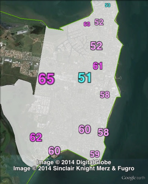 Two-party-preferred votes at the 2014 Redcliffe by-election.
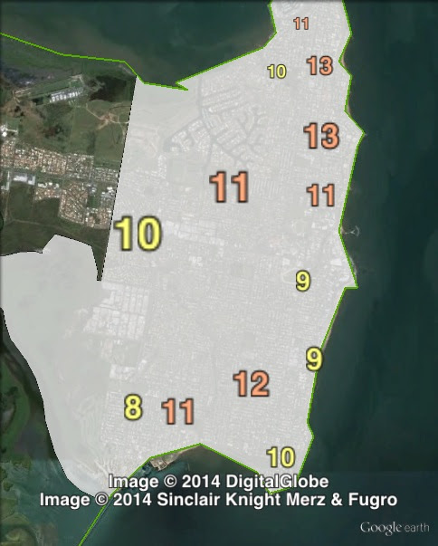 Primary votes for independent candidate Len Thomas at the 2014 Redcliffe by-election.