By James Hansen, Makiko Sato and Reto Ruedy (available at PDF
here)
The greatest barrier to public recognition of human-made climate change is probably the natural variability of local climate. How can a person discern long-term climate change, given the notorious variability of local weather and climate from day to day and year to year?
 |
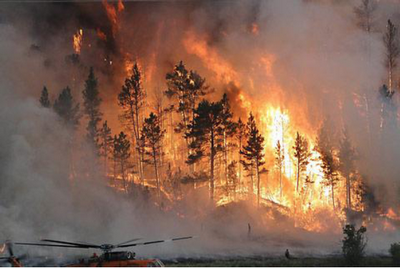
| Figure 1: Fire fighters battle the Taylor Creek blaze, one of several fires which have burned over 75,000 acres in southeastern Montana in summer 2012. Image credit: USFWS/Gerald Vickers via InciWeb.org. |
The question is important because actions to stem emissions of gases that cause global warming are unlikely until the public appreciates the significance of global warming and perceives that it will have unacceptable consequences. Thus when nature seemingly provides evidence of climate change it needs to be examined objectively by the public, as well as by scientists.
Therefore it was disappointing that most early media reports on the heat wave, widespread drought, and intense forest fires in the United States in 2012 did not mention or examine the potential connection between these climate events and global warming. Is this reticence justified?
In a new paper (Hansen et al., 2012a), we conclude that such reticence is not justified. The paper attempts to illustrate the data in ways that properly account for climate variability yet are understandable to the public.
We show how the probability of unusually warm seasons is changing, emphasizing summer when the changes have large practical effects. We calculate seasonal-mean temperature anomalies relative to average temperature in the base period 1951-1980. This is an appropriate base period because global temperature was relatively stable and still within the Holocene range to which humanity and other planetary life are adapted (note 1).
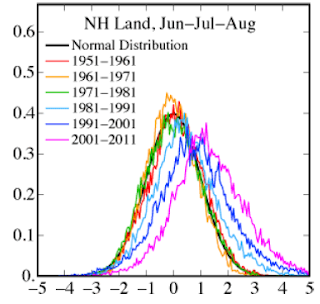
We illustrate variability of seasonal temperature in units of standard deviation (σ), including comparison with the normal distribution (“bell curve”) that the lay public may appreciate. The probability distribution (frequency of occurrence) of local summer-mean temperature anomalies was close to the normal distribution in the 1950s, 1960s and 1970s in both hemispheres (Figure 2). However, in each subsequent decade the distribution shifted toward more positive anomalies, with the positive tail (hot outliers) of the distribution shifting the most.
 |
| Figure 2. Temperature anomaly distribution: The frequency of occurrence (vertical axis) of local temperature anomalies (relative to 1951-1980 mean) in units of local standard deviation (horizontal axis). Area under each curve is unity. Image credit: NASA/GISS. |
An important change is the emergence of a subset of the hot category, extremely hot outliers, defined as anomalies exceeding +3σ. The frequency of these extreme anomalies is about 0.13% in the normal distribution, and thus in a typical summer in the base period only 0.1-0.2% of the globe is covered by such hot extremes. However, we show that during the past several years the global land area covered by summer temperature anomalies exceeding +3σ has averaged about 10%, an increase by more than an order of magnitude compared to the base period. Recent examples of summer temperature anomalies exceeding +3σ include the heat wave and drought in Oklahoma, Texas and Mexico in 2011 and a larger region encompassing much of the Middle East, Western Asia and Eastern Europe, including Moscow, in 2010.
The question of whether these extreme hot anomalies are a result of global warming is often answered in the negative, with an alternative interpretation based on meteorological patterns. For example, an unusual atmospheric “blocking” situation resulted in a long-lived high pressure anomaly in the Moscow region in 2010, and a strong La Niña in 2011 may have contributed to the heat and drought situation in the southern United States and Mexico. However, such meteorological patterns are not new and thus as an “explanation” fail to account for the huge increase in the area covered by extreme positive temperature anomalies. Specific meteorological patterns help explain where the high pressure regions that favor high temperature and drought conditions occur in a given summer, but the unusually great temperature extremities and the large area covered by these hot anomalies is a consequence of global warming, which is causing the bell curve to shift to the right (Fig. 2).
Yet the distribution of seasonal temperature anomalies (Fig. 2) also reveals that a significant portion (about 15 percent) of the anomalies are still negative, corresponding to summer-mean temperatures cooler than the average 1951-1980 climate. Thus people should not be surprised by the occasional season that is unusually cool. Cool anomalies as extreme as -2σ still occur, because the anomaly distribution has broadened as well as moved to the right. In other words, our climate now encompasses greater extremes.
Our analysis is an empirical approach that avoids use of global climate models, instead using only real world data. Theories for the cause of observed global temperature change are thus separated as an independent matter. However, it is of interest to compare the data with results from climate models that are used to simulate expected global warming due to increasing human-made greenhouse gases.
Indeed, the “climate dice” concept was suggested in conjunction with climate simulations made in the 1980s (Hansen et al., 1988) as a way to describe the stochastic variability of local temperatures, with the implication that the public should recognize the existence of global warming once the dice become sufficiently “loaded” (biased). Specifically, the 10 warmest summers (Jun-Jul-Aug in the Northern Hemisphere) in the 30-year period (1951-1980) were used to define the “hot” summer category, the 10 coolest the “cold” category, and the middle 10 the “average” summer. Thus it was imagined that two sides of a six-sided die were colored red, blue and white for these respective categories. The divisions between “hot” and “average” and between “average” and “cold” occur at +0.43σ and -0.43σ for a normal distribution.
Temperatures simulated in a global climate model (Hansen et al., 1988) reached a level such that four of the six sides of the climate dice were red in the first decade of the 21st century for greenhouse gas scenario B, which is an accurate approximation of actual greenhouse gas growth (Hansen and Sato 2004; updates are provided by a Columbia Univ. webpage). Observed summer temperature anomalies over global land during the past decade averaged about 75% in the “hot category”, thus midway between four and five sides of the die were red, which is reasonably consistent with expectations.
The relation between the bell curve and climate dice is illustrated in Figure 3. Extremely hot outliers already occur more frequently than unusually cold seasons. If the march of the bell curve to the right continues unabated, within a few decades even the seasons that were once considered average will cease to occur.
 |
Figure 3. Frequency of occurrence (vertical axis) of local June-July-August temperature
anomalies (relative to 1951-1980 mean) for Northern Hemisphere land in units of local standard deviation (horizontal axis). Temperature anomalies in the period 1951-1980 match closely the normal distribution (“bell curve”, shown in green), which is used to define cold (blue), typical (white) and hot (red) seasons, each with probability 33.3%. The distribution of anomalies has shifted to the right as a consequence of the global warming of the past three decades such that cool summers now cover only half of one side of a six-sided die, white covers one side, red covers four sides, and an extremely hot (red-brown) anomaly covers half of one side.. |
We have shown that the increased frequency of “hot” seasons is a result of global warming. The cause of global warming is a separate matter, but observed global warming is now attributed with high confidence to increasing greenhouse gases (IPCC 2007a).
Both attributions are important. Together they allow us to infer that the area covered by extreme hot anomalies will continue to increase in coming decades and that even more extreme outliers will occur. Indeed, we conclude that the decade-by-decade shift to the right of the temperature anomaly distribution (Fig. 2) will continue, because Earth is now out of energy balance, with more solar energy absorbed than heat radiation emitted to space (Hansen et al., 2011); it is this imbalance that drives the planet to higher temperatures. Even an exceedingly optimistic scenario for fossil fuel emissions reduction, 6%/year beginning in 2013, results in global temperature rising to almost 1.2°C relative to 1880-1920, which compares to a current level ~0.8°C (Hansen et al., 2012b).
 |
Figure 4. Wildfire frequency and spring-summer temperature in the western United States.
Image credit: Westerling et al. (2006). |
Practical effects of increasingly loaded climate dice occur mainly via amplified extremes ofEarth’s water cycle. The broadening of the “bell curve” of temperature anomalies is related to interactions of warming with the water cycle. Hot summer anomalies occur when and where weather patterns yield an extended period of high atmospheric pressure. This condition is amplified by global warming and the ubiquitous surface heating due to elevated greenhouse gas levels, thus increasing the chances of an extreme anomaly. Yet global warming also increases atmospheric water vapor overall, causing, at other times or places, more extreme rainfall and floods, consistent with documented changes over Northern Hemisphere land and the tropics (IPCC 2007b).
The (Northern Hemisphere) summer of 2012 is still unfolding. A global map of the anomaly distribution will be provided on a Columbia Univ. webpage once the data are complete; the data so far suggest that parts of the United States and Asia likely will be in the extreme (+3σ) category. One of the consequences of extreme summer heat anomalies is increased area and intensity of wildfires, as shown in Fig. 4. Updates of these data and other climate impacts after the 2012 data are complete will be useful for assessing impacts of continued global warming.
Related Articles
NASA News: How Warm was Summer 2010?
NASA Earth Observatory: Image of the Day, Aug. 9, 2010: Heatwave in Russia
NASA Earth Observatory: Image of the Day, June 29, 2012: Heat Wave Fuels Wildfires in the Rockies
NASA Earth Observatory: Image of the Day, July 17, 2012: Drought Grips the United States
Footnote
1 In contrast, we infer that current global temperature is above the Holocene range, as evidenced by the fact that the ice sheets in both hemispheres are now rapidly shedding mass (Rignot et al., 2011) and sea level is rising (Nerem et al., 2006) at a rate (more than 3 mm/year or 3 m/millennium) that is much higher than the rate of sea level change during the past several millennia.
References
Hansen, J., I. Fung, A. Lacis, D. Rind, Lebedeff, R. Ruedy, G. Russell, and P. Stone, 1988: Global climate changes as forecast by Goddard Institute for Space Studies three-dimensional model. J. Geophys. Res., 93, 9341-9364, doi:10.1029/JD093iD08p09341.
Hansen, J., and Mki. Sato, 2004: Greenhouse gas growth rates. Proc. Natl. Acad. Sci., 101, 16109-16114, doi:10.1073/pnas.0406982101.
Hansen, J., Mki. Sato, P. Kharecha, and K. von Schuckmann, 2011: Earth’s energy imbalance and implications. Atmos. Chem. Phys., 11, 13421-13449, doi:10.5194/acp-11-13421-2011.
Hansen, J., Mki. Sato, and R. Ruedy, 2012a: Perception of climate change. Proc. Natl. Acad. Sci., in press. Early draft posted as “Public perception of climate change and the new climate dice”, arXiv.org:1204.1286.
Hansen, J., P. Kharecha, Mki. Sato, F. Ackerman, P.J. Hearty, O. Hoegh-Guldberg, S.-L. Hsu, F. Krueger, C. Parmesan, S. Rahmstorf, J. Rockstrom, E.J. Rohling, J. Sachs, P. Smith, K. Steffen, L. Van Susteren, K. von Schuckmann, and J.C. Zachos, 2012b: Scientific case for avoiding dangerous climate change to protect young people and nature. Proc. Natl. Acad. Sci., submitted.
Intergovernmental Panel on Climate Change (IPCC), 2007a: Climate Change 2007: The Physical Science Basis. Solomon, S., et al. eds., Cambridge University Press, 996 pp.
Intergovernmental Panel on Climate Change (IPCC), 2007b: Climate Change 2007, Impacts, Adaptation and Vulnerability. Parry, M.L., Canziani, O.F., Palutikof, J.P., Van Der Linden, P.J., and Hanson, C.E. eds., Cambridge Univ Press, 996 pp.
Nerem, R.S., Leuliette, E., and Cazenave, A., 2006: Present-day sea-level change: A review. C. R. Geosci., 338, 1077-1083, doi:10.1016/j.crte.2006.09.001.
Rignot, E., Velicogna, I., van den Broeke, M.R., Monaghan, A., and Lenaerts, J., 2011: Acceleration of the contribution of the Greenland and Antarctic ice sheets to sea level rise. Geophys. Res. Lett., 38, L05503, doi:10.1029/2011GL046583.
Westerling, A.L., Hidalgo, H.G., Cayan, D.R., Swetnam, T.W., 2006: Warming and earlier spring increase western U.S. forest wildfire activity. Science, 313, 940-943, doi:10.1126/science.1128834.
Contact
Please address all inquiries about this research to Dr. James Hansen.


Leave a Reply
You must be logged in to post a comment.