014 Huffpost Green

-

-
-

Here’s A Lot Of Beefcake In The Name Of Being Kind To Animals
-

The National Zoo Gave Their Otters A Keyboard To Play With. It’s Fantastic.
-

-

It’s Beach Season On The Great Lakes But That Doesn’t Mean The Ice Is Gone
-

WATCH: About A Dozen Sharks Surround Surfers At Florida Beach. This Is No Movie.
-

-

Why These Goalies Are Worried About Unknown Toxins In Artificial Turf
-
-

-

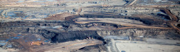
One Of America’s Dirtiest Coal Plants Had Some Dire Predictions. It Was Wrong.
-

-
-
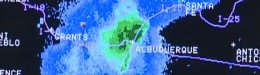
As Hurricane Season Begins, New Storm Surge Maps Emphasize Importance Of Preparedness

United States flags are displayed on flood-damaged homes in the Breezy Point section of Queens, N.Y., Wednesday, Nov. 28, 2012. (AP Photo/Mark Lennihan)
This story originally appeared on Climate Central.
When Hurricane Sandy struck the Northeast, it was not the storm’s winds but the massive pile of water those winds pushed in front of the storm that wreaked the most havoc, inundating coastal areas in 3 to 9 feet of water, causing billions in damages, and leaving dozens dead. In general, this storm surge poses a far greater threat to lives and property than winds when hurricanes and tropical storms hit.
It’s with this in mind that the National Hurricane Center (NHC) has developed an experimental system that maps the projected storm surge in areas under threat from tropical cyclones — just in time for this hurricane season, which began on Sunday, June 1.
Sandy was no different than most other tropical cyclones, the generic term for hurricanes and typhoons, with the major proportion of its damage caused by storm surge. In the 50-year period from 1963 to 2012, storm surge accounted for nearly half of all tropical cyclone deaths in the U.S., according to a recent study in the Bulletin of the American Meteorological Society. That’s far more than the 8 percent the study attributed to the high winds many assume to be the biggest danger in a hurricane. Yet wind speed continues to be the main measure of a cyclone’s strength, determining when a tropical storm becomes a hurricane and what “category” ranking a hurricane receives.
It’s this unappreciated threat from storm surge that prompted the NHC to begin issuing experimental storm surge flooding maps for all tropical cyclones that threaten U.S. coasts starting with the 2014 hurricane season. The maps will show how high a particular storm’s surge is expected to get in different areas and how far inland it could go.
“This is a really desperately needed update,” said Jamie Rhome, a storm surge specialist with the NHC who is heading the mapping effort.
Adding to the need for such a warning mechanism is the fact that the population along coastal areas has been rising, putting more people in harm’s way. And rising sea levels — the result of the ocean warming and ice melting due in part to warming global temperatures — are increasing the storm surge threat. Some research has also suggested that Atlantic basin storm could become more intense, if less frequent, which could effect the level of storm surge coastal communities experience.
While Sandy brought threat of storm surge to the public’s attention, it was an earlier storm that jump-started the NHC’s efforts to produce inundation maps: Hurricane Ike, which hit Galveston, Texas, on Sept. 13, 2008, as a Category 2 hurricane and brought storm surge that reached 15-20 feet above normal tides.
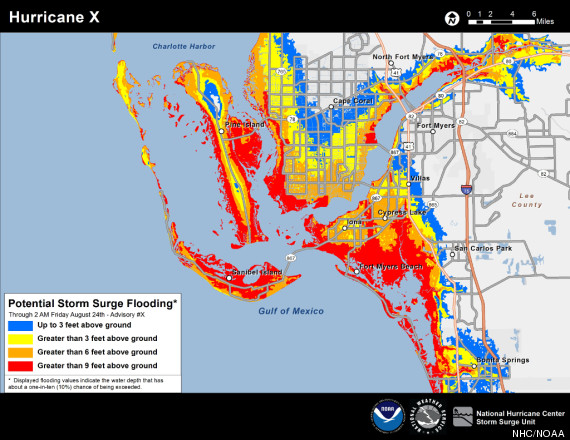
An example of a new storm surge mapping tool unveiled by the National Hurricane Center as an experimental product during the 2014 season. This map shows how a hypothetical Hurricane ‘X’ might impact Ft. Myers, Fla., with different levels of storm surge color coded. Credit: NHC/NOAA
Rhome said that the effort began shortly after Ike, when social scientists were brought in to help run focus groups and tell the hurricane researchers what kind of tool would be most useful to the public. Based on that feedback, Rhome and his team spent the last few years refining the maps.
Sandy just “shined a big spotlight on the project” and helped expedite its release, Rhome told Climate Central. Recent advances in computer models and the growing availability of detailed topographical data, both critical for telling how high waters could rise, have also helped bring the project to fruition and the resulting maps will now be tested over the next two hurricane seasons.
Each map will show the area under threat from storm surge, with color-coded ratings showing how high the water could get above the ground in different areas. The scale runs from blue to red and represents water rising anywhere from up to 3 feet to more than 9 feet above ground.
The maps are based on several factors including how big the incoming storm is, its intensity, and the track it is expected to take since winds on the right side of a storm will push water toward shore, while the winds on the left side will push it away. The ratings also take into account astronomical tides and the elevation of the land under threat.
Maps will be issued for a given storm when a hurricane watch or warning is issued, and in some cases for a tropical storm watch or warning, when any place along the U.S. Gulf or East Coast is under threat.
Throughout the two-year experimental run, Rhome and his colleagues will see how the maps perform in showing where the surge actually occurs. And if the season is as uneventful for the U.S. as it was in 2013? Then the team will create “fake” storms to see what the models predict.
“There’ll still be ways to test it,” Rhome said.
Rhome and his team will also be looking for feedback from officials and the public. The NHC has a survey set up on its site where users can leave comments.
So far, the feedback “has been incredibly if not overwhelmingly positive,” Rhome said.
Also on HuffPost:
Leave a Reply
You must be logged in to post a comment.