
Tackling Climate Change ‘Would Save Millions of Lives’
- Published: September 30th, 2013

By Damian Carrington, The Guardian
Tackling climate change would save millions of lives a year by the end of the century purely as a result of the decrease in air pollution, according to a new study.
 Cutting air pollution from curbing fossil-fuel use could prevent millions of premature deaths – even without factoring in the impact of other climate impacts such as more extreme weather and sea-level rise.
Credit: Simon Forsyth/Flickr
The study is published as scientists from around the globe gather in Stockholm to thrash out final details of a landmark assessment of climate science. Their final report is due to be released on Friday, September 27 and will set out projections of wide-ranging impacts of global warming from droughts to floods to sea-level rise.
The research suggests that the benefits of cuts to air pollution from curbing fossil-fuel use justify action alone – even without other climate impacts such as more extreme weather and sea-level rise.
“It is pretty striking that you can make an argument purely on health grounds to control climate change,” said Jason West, at the University of North Carolina at Chapel Hill, whose work is published in Nature Climate Change.
West’s team compared two futures, one in which climate change is stabilized by aggressive cuts in greenhouse gas emissions and one in which emissions are not curbed. The scientists then modeled how this affected air pollutants and the consequent effects on health.
They found that 300,000-700,000 premature deaths a year would be avoided in 2030, 800,000 – 1.8 million in 2050 and 1.4 million to 3 million in 2100. By mid-century, the world’s population is expected to peak at around 9 to 10 billion.
A key finding was that the value of the health benefits delivered by cutting a ton of carbon dioxide (CO2) emissions was $50-$380, greater than the projected cost of cutting carbon in the next few decades. The benefits do not accrue from reductions in CO2 per se but because of associated pollutants released from burning fossil fuels.
It is possible to reduce pollutants in fossil fuel emissions more cheaply without switching to low carbon sources of power – for example with scrubbers on coal plants that remove nitrous oxides and sulfur oxides; or by cars switching from diesel to petrol – but the authors say it is striking that the value of health benefits outweigh the costs of cutting carbon.
The benefits were particularly great in China and east Asia, where the value of health improvements was between 10 and 70 times greater than the cost of reducing emissions. “The benefits in north America and Europe are still pretty high, but in east Asia you have a very high population exposed to very bad air pollution, so there are lots of opportunities for improvement there,” said West.
The research analyzed how cutting emissions from coal-fired power plants, cars and other sources reduced levels of small pollution particles (PM2.5) which increase heart attacks, strokes and lung cancer and of ozone, which causes respiratory illnesses.
Unlike previous studies, which have tended to focus on specific countries or regions, the new study took a global perspective. “Air pollution does not stop at the border,” said West. “If China reduces pollution, people outside of China benefit as some pollution travels across the Pacific or the other way into south-east Asia.”
Another key difference of the new work was including future population increases and the rising longevity of people, which means they are more likely to be affected by cardiovascular diseases, rather than dying young from infectious diseases. The ranges in the estimates of premature deaths avoided and the economic benefits arise from the relative uncertainty of how people’s health responds to air pollution and the range of valuations used for lives, with the U.S. Environmental Protection Agency using a value of $7 million per life, while the European Union uses $2 million per life.
The wider assessment from the Intergovernmental Panel on Climate Change due on September 27, its first since 2007, will play a crucial role in the international negotiations towards a global deal to tackle global warming in 2015. West said: “Climate change is a long-term problem and the benefits of any action taken by one country are shared out among all: both of these things make reaching and an agreement difficult. But the air pollution co-benefits are local, tangible and near term, with air quality improving within weeks. That strengthens the argument for taking action.”
Reprinted from The Guardian with permission.
- Posted in Causes, Greenhouse Gases, Impacts, Climate, Carbon Storage, Oceans & Coasts, Sea Level, Energy, Fossil Fuels, Weather, Extreme Weather, Global, United States
Comments
- The Global Energy Assessment – Chapter 11: Renewable Energy
- The Global Energy Assessment – Chapter 12: Fossil Energy Systems
- The Global Energy Assessment – Chapter 17: Energy Pathways for Sustainable Development
- Coal and Biomass to Fuels and Power
- Making Fischer-Tropsch Fuels and Electricity from Coal and Biomass: Performance and Cost Analysis
Gallery
 Did you know…? The peak of hurricane & tropical storm activity doesn’t usually come until Sept. 10.


 Methane leaks in Boston area. Yellow indicates methane levels above 2.5 parts per million. Via
  The global-warming potential (GWP) of methane over 20 years and 100 years, with and without climate-carbon feedbacks (cc fb). Via IPCC.


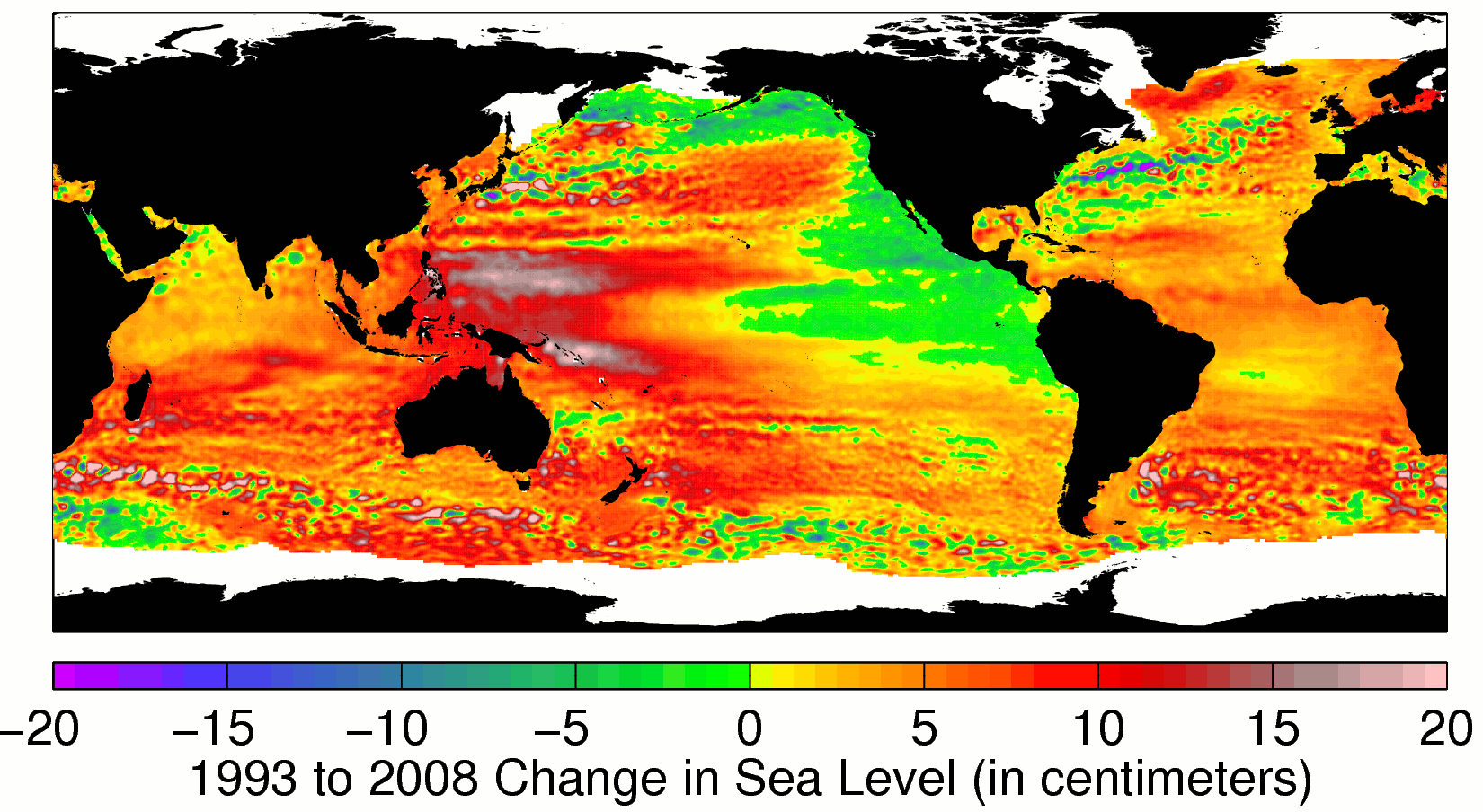 The change in the world’s sea level between 1993 and 2008. Black areas are land; colored are the oceans. Yellow and red regions show rising sea level, while green and blue regions show falling sea level. White regions are missing data during parts of the year. Nearly everywhere, sea level is rising, and the global average is clearly rising fast. But the patterns of sea level change (the regional variations) are complicated.